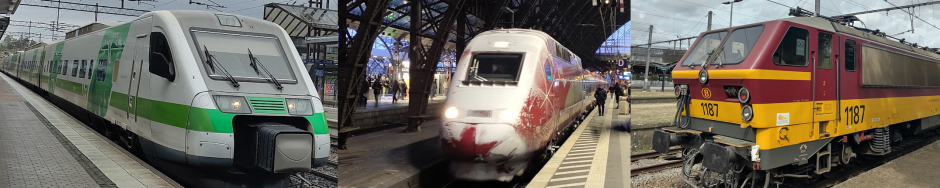

To view the map in full resolution, please see the pdf upload here. Originally shared on Reddit and LinkedIn.
When the Nederlandse Spoorwegen (NS) announced a design contest to create a new map of Dutch railway services for 2027, I couldn’t not participate. This is the mission I was born for!
I’d made lots of transit diagrams before, but always on my own initiative. This time I was actually doing it for someone, and with some actual specifications. Keeping to A0 format was the most challenging – I’m used to just drawing the map and then letting the final dimensions be what they are, but this time I had to stick to a predefined canvas size.
In addition I imposed some constraints of my own to hopefully make the design stronger:
- All station labels horizontal.
- Lines pass through every station they physically pass through (even $%#!@ Hoevelaken) even if they don’t call there.
- No information conveyed through colour – the colours are purely there for readability and structure. You could make a black-and-white monochrome version of this map and technically speaking it would still convey the same information, even if it would be much harder to read of course.
- Limited number of different colours, and at least an attempt to make the most important contrasts hold up under different forms of colour blindness.
Lines to include
The contest specs included a list of lines which the NS kindly sent to me as an Excel spreadsheet as well on request. However there were quite some errors and omissions. Moreover I absolutely wanted to include the longer-distance international services, even the night trains – promoting sustainable travel within Europe is important to me!
For a full overview of which extra lines I included, how I numbered them and how I corrected (apparent) errors in the original table, see this overview (in Dutch).
One I’m sad to have missed is the new cross-border service Emmen – Coevorden – Bad Bentheim! I was aware of this project and glad that it was finally being realised; I just hadn’t caught the news that it would already start operations in 2027.
Defining the geometry
The earliest stage of the project mostly consisted of staring at the geographical structure of the network in OpenRailwayMap, trying to identify which lines I could straighten out and which angles I could use. I think I went through 10 different designs (including some very funky isometric ones inspired by Escher’s impossible waterfall) and I was about to throw down my virtual pencil in frustration, when I decided to try one more time, in an iterative way. No more predefined concepts like “I want stations A, B, C and D to be on a straight line” or “the lines A-B and B-E should make an angle of X degrees”; just pick a font size and a line thickness and start drawing, first solving the very nasty Amsterdam – Utrecht – Amersfoort triangle and then building outward from there. I went with 30° angles – not the most exciting choice, but a little more dynamic than 45° in my opinion. The sharp-eyed reader will catch the one exception I allowed myself: the 15° angle for Leiden – Woerden.
The fun thing is, that as I started drawing bit-by-bit, eventually some of the nice, clean lines I had rejected as not feasible – most notably the straight line from The Hague to Twente – emerged sort of naturally as the best solution after all!
Ultimately, the font size is the most defining for how much room certain sections will take, as station names have to be a certain space apart in order to be easily matched to their respective stations. And given a fixed canvas size, it’s really a bit of a gamble: whichever approach I took – first drawing some lines in a desired geometry and then filling in the station labels; or first putting all the station labels on the map and then gradually filling in the line geometry; or just building the whole thing region by region as I ended up doing – I didn’t find a way to see if the chosen font size would be too big or too small for the canvas, without actually doing the work of putting a significant chunk of the lines and labels in position.
My previous attempt, with a very ambitious 18 pt, had failed – it was technically possible to cram the entire network into the A0 format with 18 pt all-horizontal station labels, it just required so many twists and turns that it would be extremely hard to follow. For this one I went with 14 pt, set a minimum distance between stations accordingly, and hoped for the best. I think it turned out very well, with most of the canvas effectively used.
That also brings me to a point of criticism from the Reddit comments: the map isn’t very true to geography. Guilty as charged… I went for maximum use of the available space (and thus a relatively large label font, and enough spacing between stations and lines even in busy areas) with only the slightest concern for geography. Instead I relied mainly on large-font labels for the major hubs to help users orient themselves. It’s a design choice and it’s not for everyone – let’s see what the contest jury will prefer!
Detailed design elements
For this map, I finally caved and abandoned my old principle that each stop had to be a single contiguous blob. In other words I accepted the use of little “helper bars” cutting across a line that doesn’t stop at a station, to connect the stop markers of two lines that do. I don’t regret it; with such a mix of different stopping patterns, the amount of spaghetti required to get all the lines in the right order at every station would have been insane. The map is complicated enough as it is.
One thing I’m proud of is that I managed to be flexible and keep a critical eye on my own design: yes, I initially had XYZ in mind, but is the thing I want to convey really clear at a glance? For example I ended up increasing the line thickness, and especially the stop marker size, quite a lot from my original concept. For some major hubs I also had a white semi-transparent circle on top of the lines, with the station name in the circle, but I ditched that because it was poorly legible. Some of that concept survives in the circular arcs connecting those stations’ stop markers.
But the basic information of “which lines call at which stations” is only part of the design puzzle; beyond that, there is a wealth of additional information to potentially convey, and there are some tough choices to be made on what to include and in which order of importance. I decided to throw out frequency early on (some lines only run 1x per hour) but added the different operating companies late in the game; the thing with the dots and dashes was a bit of a last-minute patch and I’m not entirely satisfied with it – especially Overijssel looks a bit like it’s got measles – but it’s important practical information to include: which transfers require switching operators and hence stopping by the little check-in/check-out posts on the platform?
Even more important to convey (and thus more prominently visible through line thicknesses) is the validity of OVpay in the first place. On services that support OVpay, you can just show up at the station, check in with your debit/credit card (or dedicated transit card) and board a train, without buying a ticket in advance – quite a luxury in terms of convenience! Services that don’t support this are thus drawn with thinner lines as these are a lot less relevant for domestic travellers.
The point of the contest as communicated was to highlight the new numbering scheme for train lines, so I gave the final destinations of each line a big numbered label, as is common on tram/metro maps.
Colours
Each new map project teaches you something, and this one taught me a lot about colours. The contest specs included a minimum contrast ratio of 4.5:1 – I didn’t know what that was! Well, I do now, along with a ton of other stuff about CIELAB, CMYK, HSL, HSV, standard illuminants, standard observers, ICC profiles, the different types of colour blindness and the different approaches to modelling them. I didn’t apply all of it; in the end my approach mostly leaned on CIELAB.
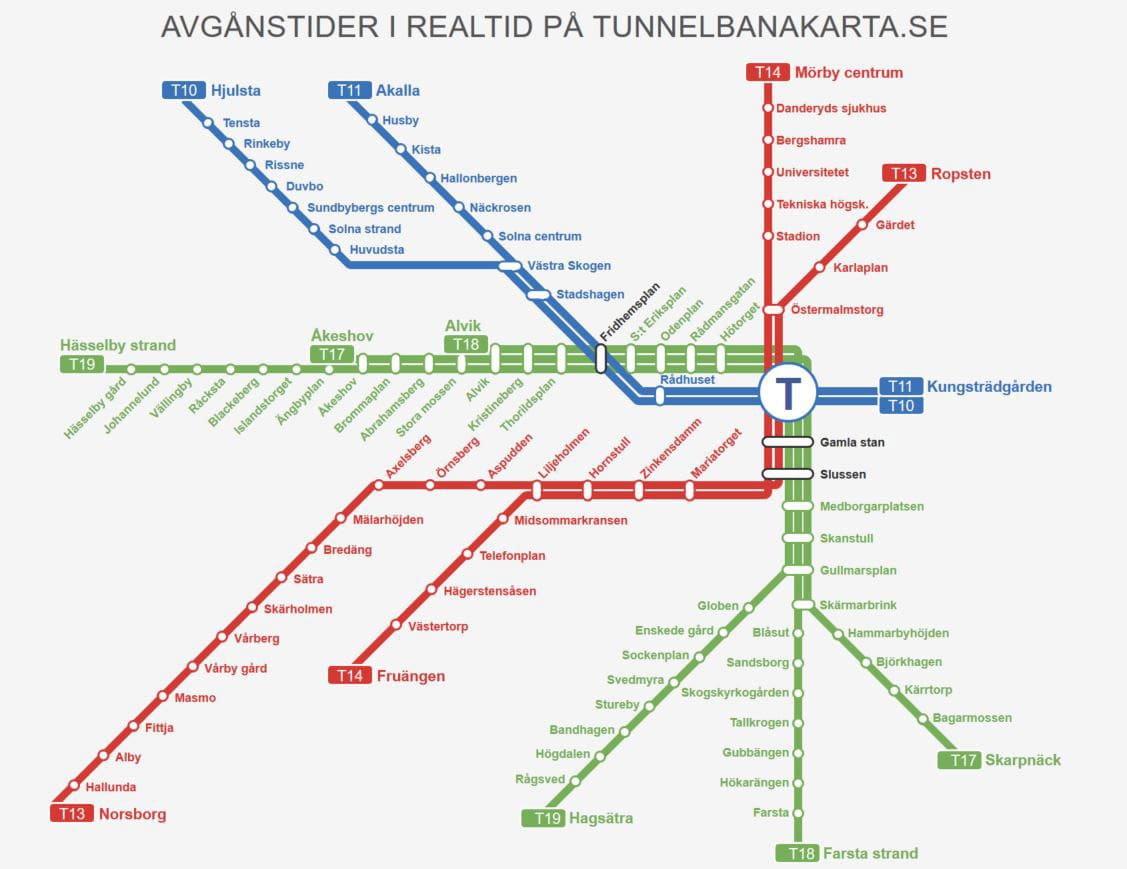
First of all, with this many lines, a strict contrast requirement and a wish to remain at least somewhat colour-blind-safe, individual line colours were right out. Instead I decided to group the intercity lines into “bundles” which go more or less the same way, and assign each bundle its own colour (an approach inspired by the Stockholm metro). The sprinters and regional lines would get more muted and uniform colours.
But how to assign the bundle colours? It was possible to pick some colours one by one and then check them for contrast against white and against each other, but what I really wanted was to reverse the process: pick the colours based on their contrast to begin with. This is where CIELAB came in.
The CIELAB colour space expresses colours in three dimensions: lightness (L); red vs. green (a*); and blue vs. yellow (b*). The underlying theory that red/green and blue/yellow are pairs of opposites in human colour perception is apparently still disputed, but I figured that using these axes would give me a reasonable shot at systematically picking colours that would be distinguishable under different kinds of colour blindness, by ensuring both “red-green contrast” and “blue-yellow contrast”.
What I ended up doing was to write a Python script – using the colormath module – that converted a bunch of CIELAB colours at various L levels to RGB and plotted them on an a* vs. b* grid. The script calculated the colour contrast against a white background and automatically eliminated any colour for which this was less than the required 4.5:1; with increasing L, fewer and fewer “allowed” colours remained. The “relative luminance” (part of the contrast calculation – a parameter which is 1 for white and 0 for black) of each colour was also displayed so I also had the option of contrasting “lighter” and “darker” colours deliberately.

Having generated a few of these grids, I started picking colours, starting with IC 5/6 vs. IC 15/19, which need to be readily distinguishable where they cross at Amersfoort. Then the bundles of IC 27/28/29, IC(D) 7/8/18/38, gradually filling up the available “corners” in terms of a*, b* and relative luminance and trying to make the most important contrasts stand out one at least 2 of those 3 axes. I ran the result through Marie Chatfield’s colour blindness simulator and was decently satisfied, although not everything can be perfect of course.
Finally I want to give a big shout-out here to Paul Tol. I initially asked him for permission to use one of his colour schemes on the map. He replied enthusiastically, and not only granted my request but even came up with a new scheme for the purpose. A fruitful e-mail exchange followed in which he provided valuable feedback on my design (beyond just the colours). I didn’t end up using his colours but I definitely recognise his contribution.
The thing with the sea
Perhaps the most common point of criticism was my somewhat unusual way of dealing with land and sea. I have a dark blue outline representing (roughly) the coastline of the country, but both land and sea are white, whereas the other contest entries I’ve seen universally use some sort of light blue fill for the sea, and usually a beige-ish fill for the land as well.
The reason here has to do with the contrast requirements again. The wording in the specs being somewhat cryptic, I erred on the side of caution and interpreted the 4,5:1 minimum as applying to any two colours that appear next to each other.
So then you either have to use a very solid blue for the water to have the required contrast against the white land (not desirable), or you have to add a dark line between the water and land anyway and you’re no further than you were. And in the latter case, well, there are some text labels that extend over the coastline, they would have to get a dark outline too… and what about the other, “inland” labels then, should they also get an outline box for consistency? In short it just becomes a big headache. I did leave some whitespace around the coastal stations to, hopefully, keep users from interpreting the coastline as another train line!